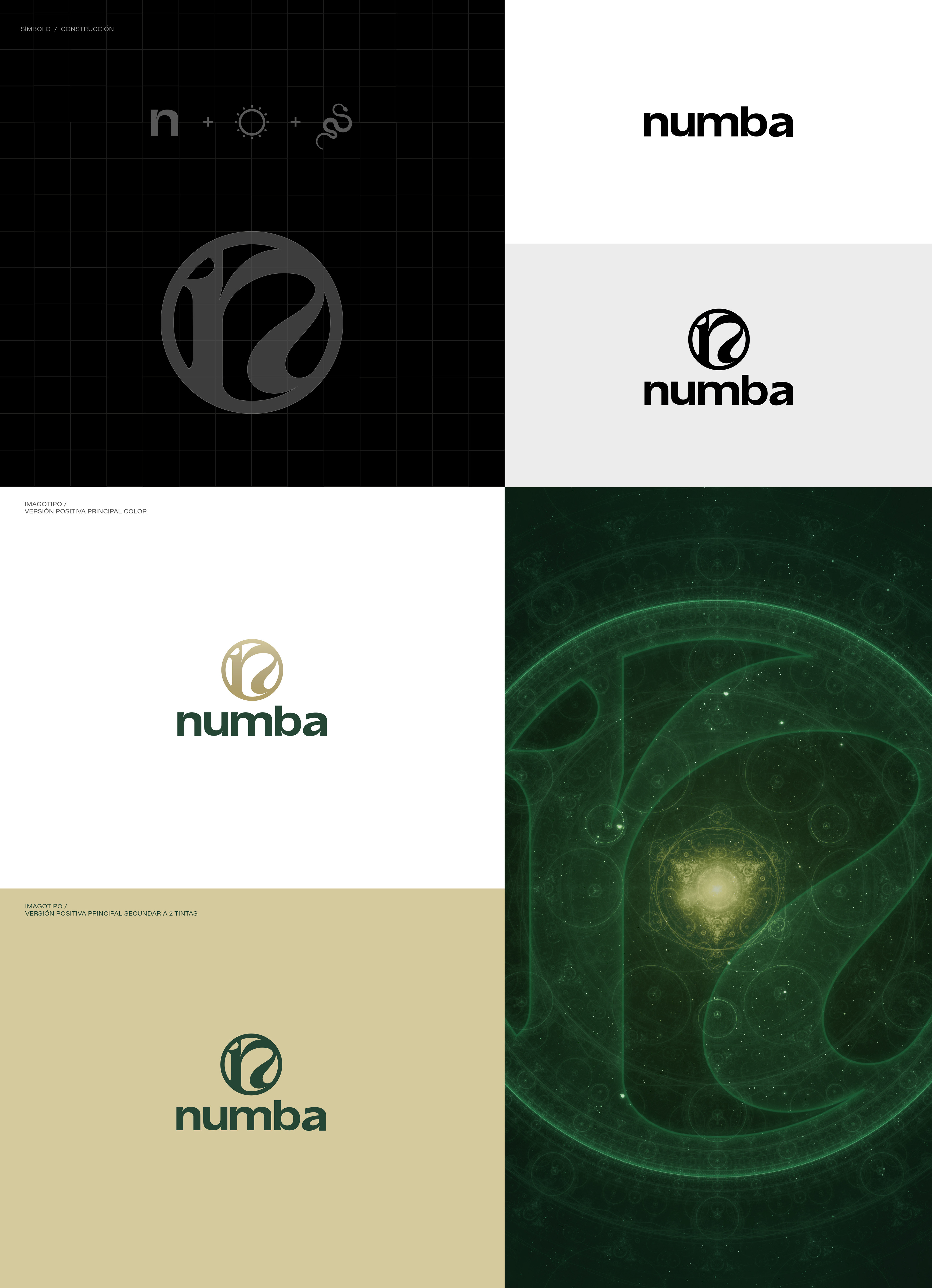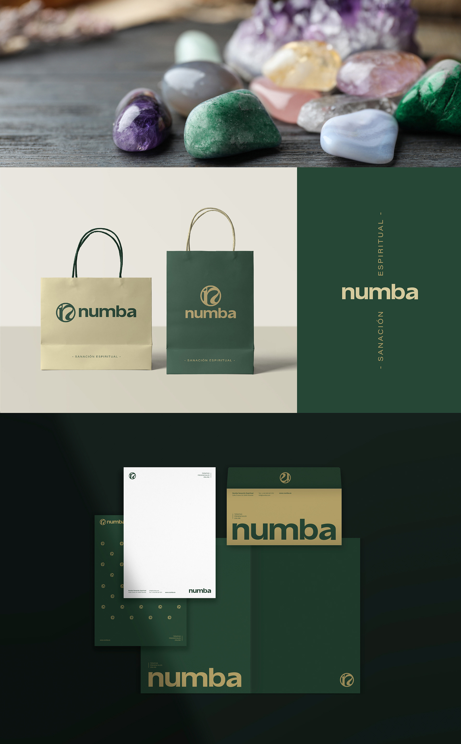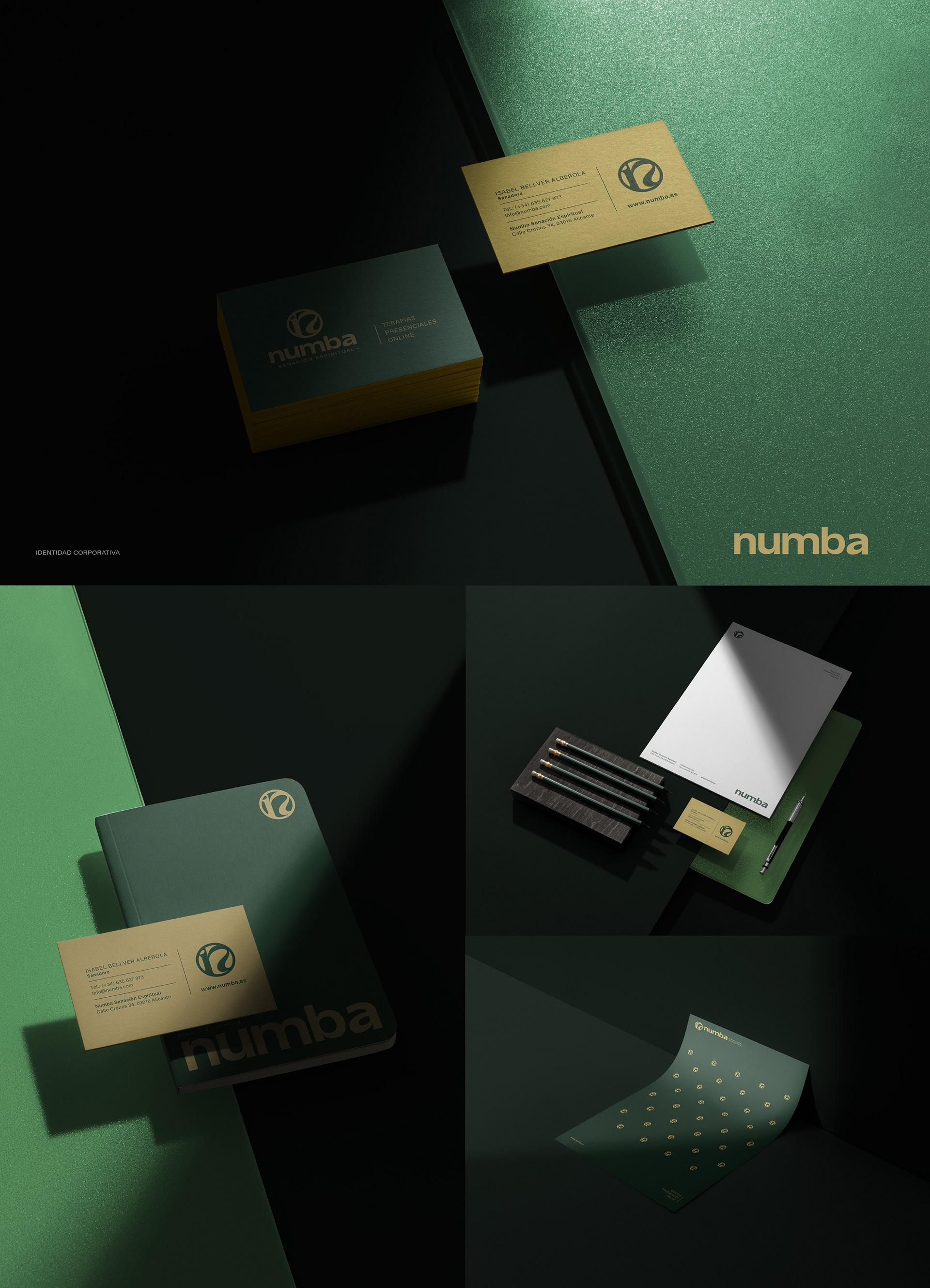
Una tipografía modificada tipo Grotesk, apoyada en el símbolo por una Serif de carácter elegante, fue la mejor opción para construir la marca y la identidad visual de este proyecto tan sumamente especial.
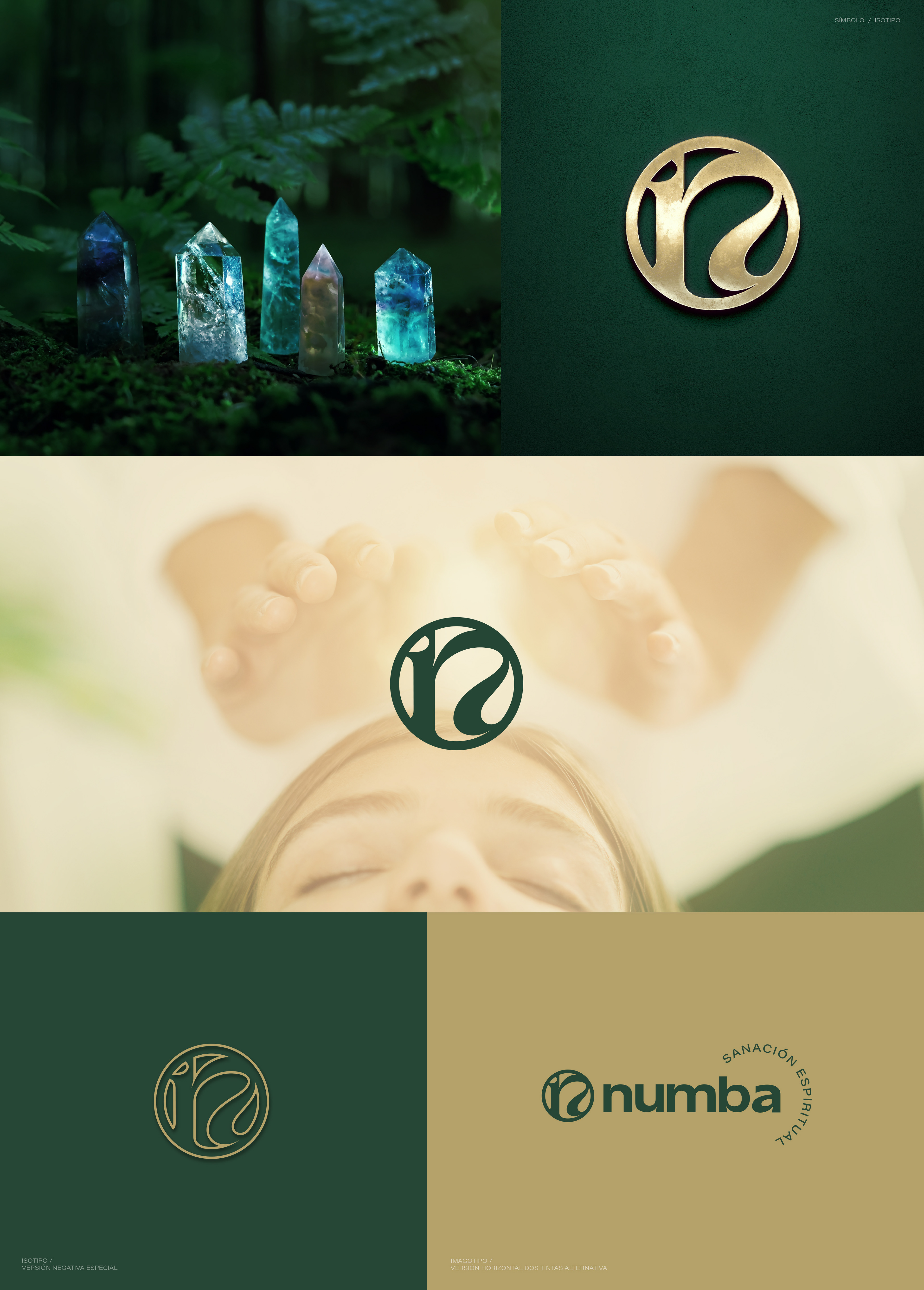
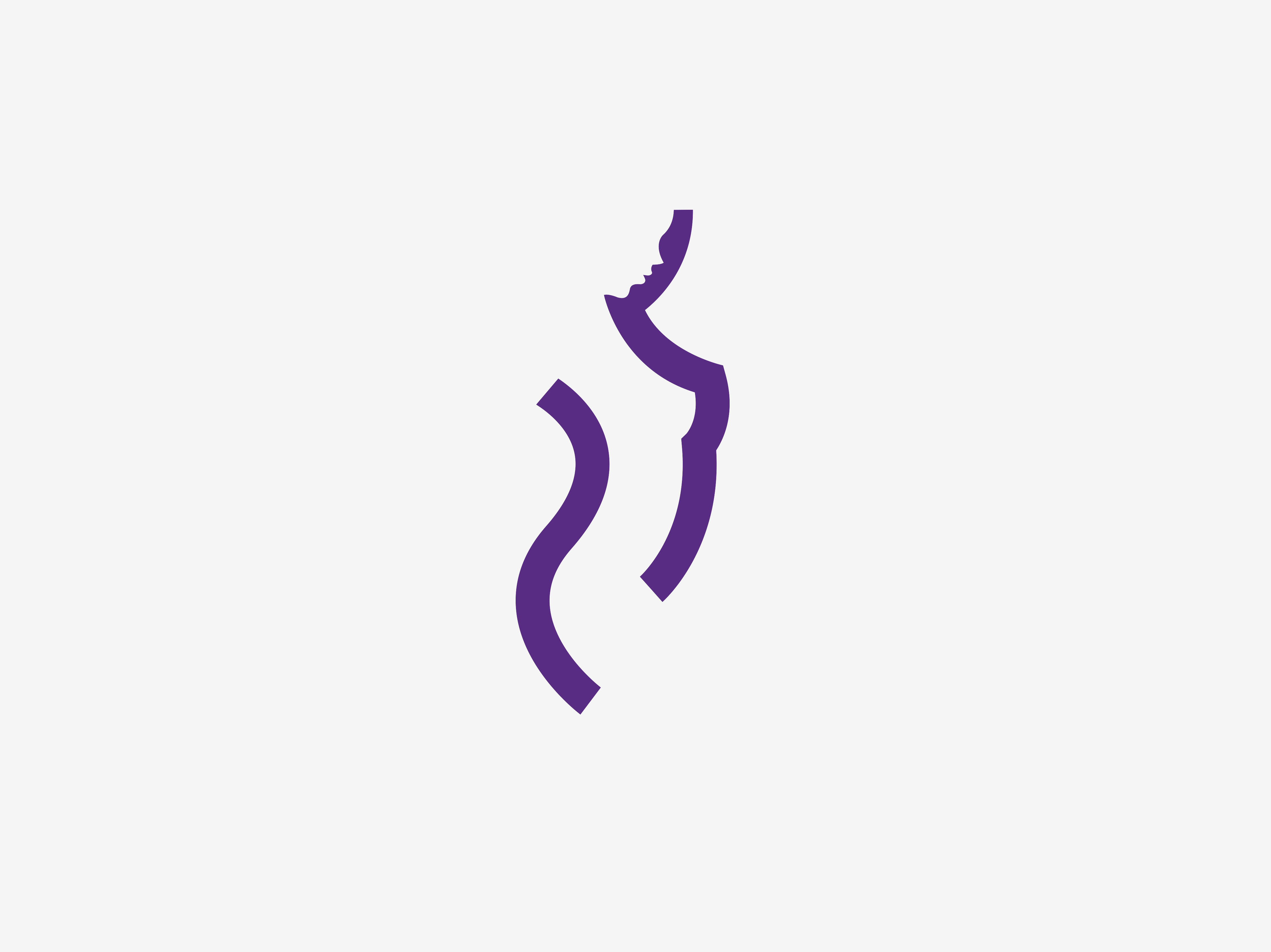
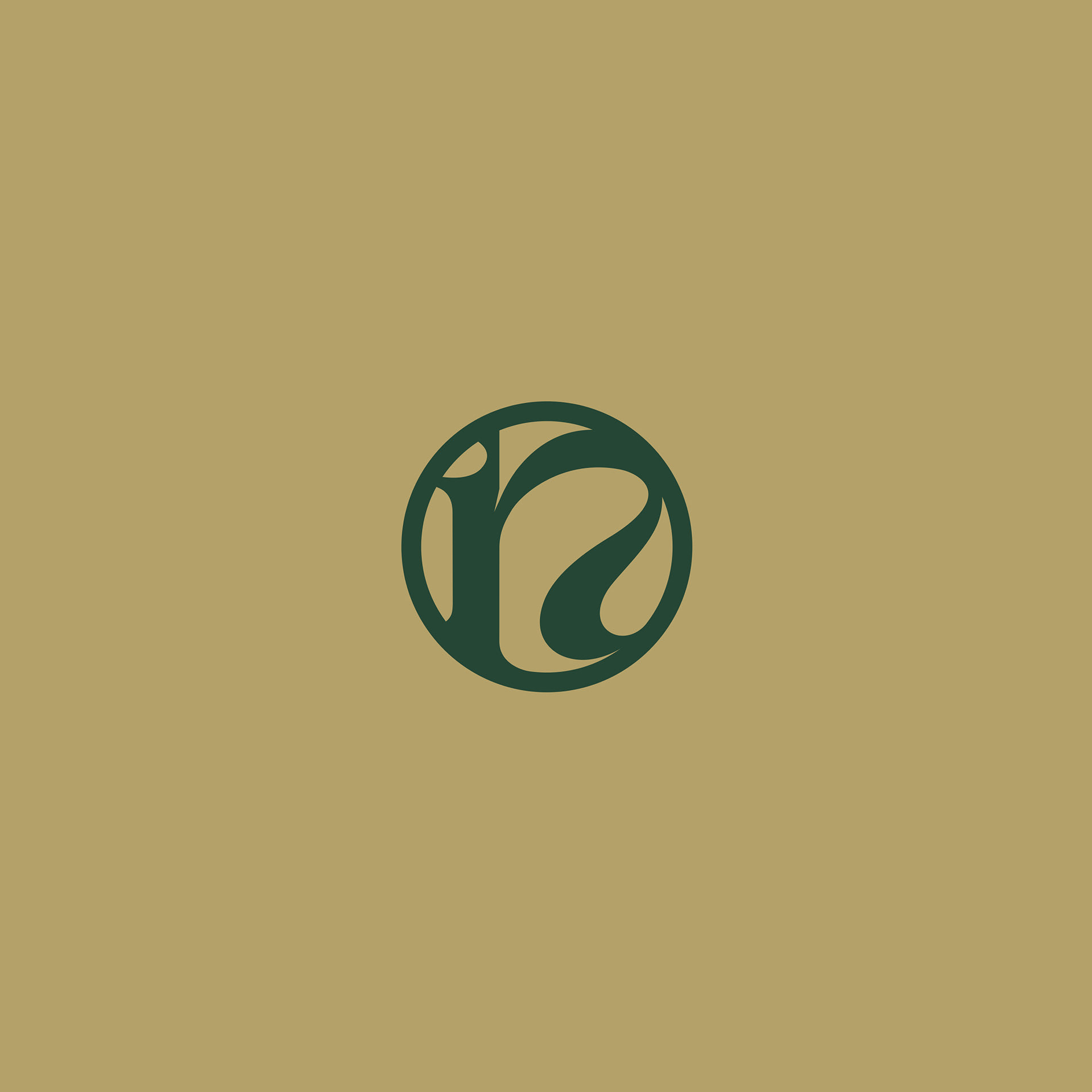
Los conceptos de armonía, equilibrio y sanación son representados con cada detalle de curvas y colores. Para ayudarme en la construcción del símbolo, el cliente me sugirió la representación gráfica de una cobra, símbolo espiritual del poder positivo y la fuerza del crecimiento, a la que le sume la letra "N" del naming, dando como resultado una marca tan representativa de la profesión como diferente y donde el símbolo se puede utilizar como icono en reducciones o grafismos.
A modified Grotesk typeface, supported by an elegant Serif font in the symbol, was the best option to build the brand and visual identity of this extremely special project.
The concepts of harmony, balance and healing are represented with every detail of curves and colors. To help me in the construction of the symbol, the client suggested the graphic representation of a cobra, a spiritual symbol of positive power and the strength of growth, to which I added the letter "N" of the naming, resulting in such a representative brand. of the profession as different and where the symbol can be used as an icon in reductions or graphics.